A calm, glanceable in-car interface
2024 | Case study / by Carmelo Bisignano, User Experience Designer Lead
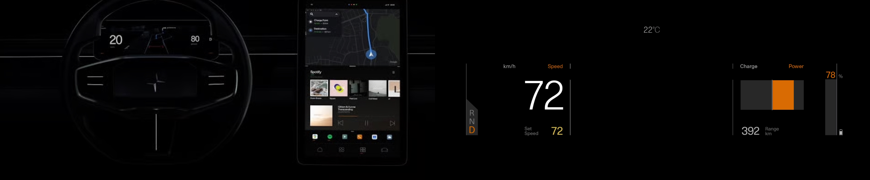
Project information
- Industry
- Automotive, HMI, infotainment
- Duration
- 6 months
- Team
- Design lead, Product manager, Engineers, QA
- My role
- UX strategy and discovery, UI design and design system, DesignOps and governance, Leading across disciplines
- Users
- Drivers, Passengers, Customer support and service teams
- Tools
- Figma, Confluence, Jira
Lead with clarity, design with empathy, and scale with systems, this is how Carmelo builds products people trust.
Overview
The screen in a Polestar should help the driver and then get out of the way.
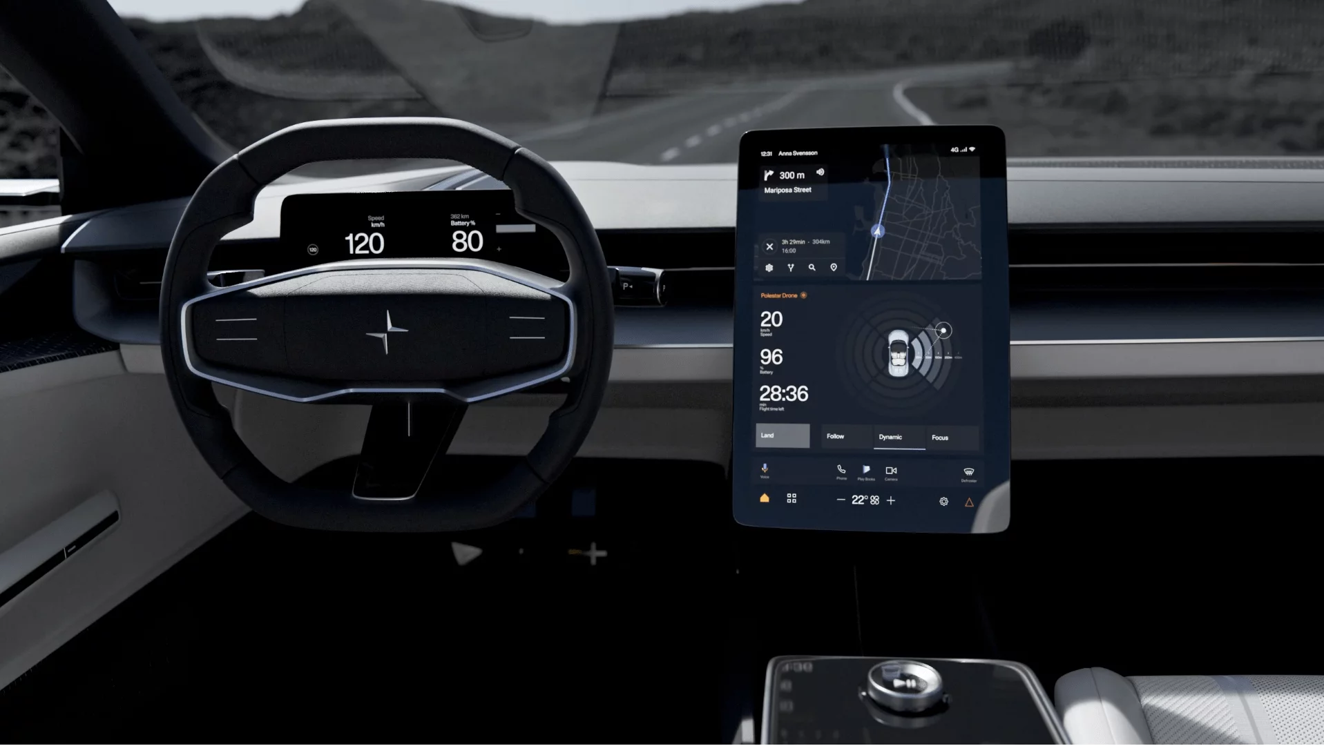
This is how a UX-led process shaped the in-car interface (HMI): readable at a glance, helpful, safe, and still unmistakably Polestar.
Objective
Lower the driver's mental load and raise their confidence. The actions people use most should take no effort, everything should read in a glance or work by voice, and the system should feel like Polestar and no other brand.
Approach
Discovery came first. Then I kept Product, Engineering and DesignOps in step through delivery. Every decision was checked against three questions: is it safe, is it quick, is it calm?
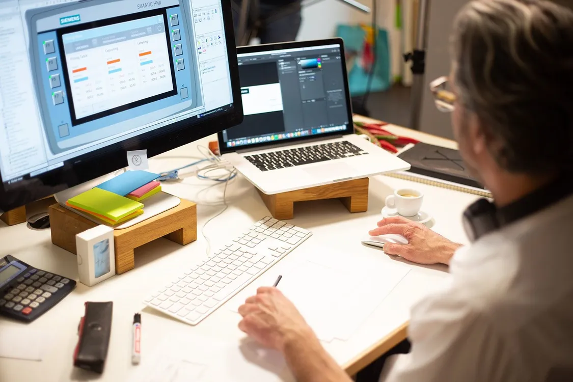
We did quick field research, heuristic reviews of competitors' HMIs, task timing studies and service blueprints. From those came an interaction model, an information architecture and a component system that let us iterate fast without dropping quality.
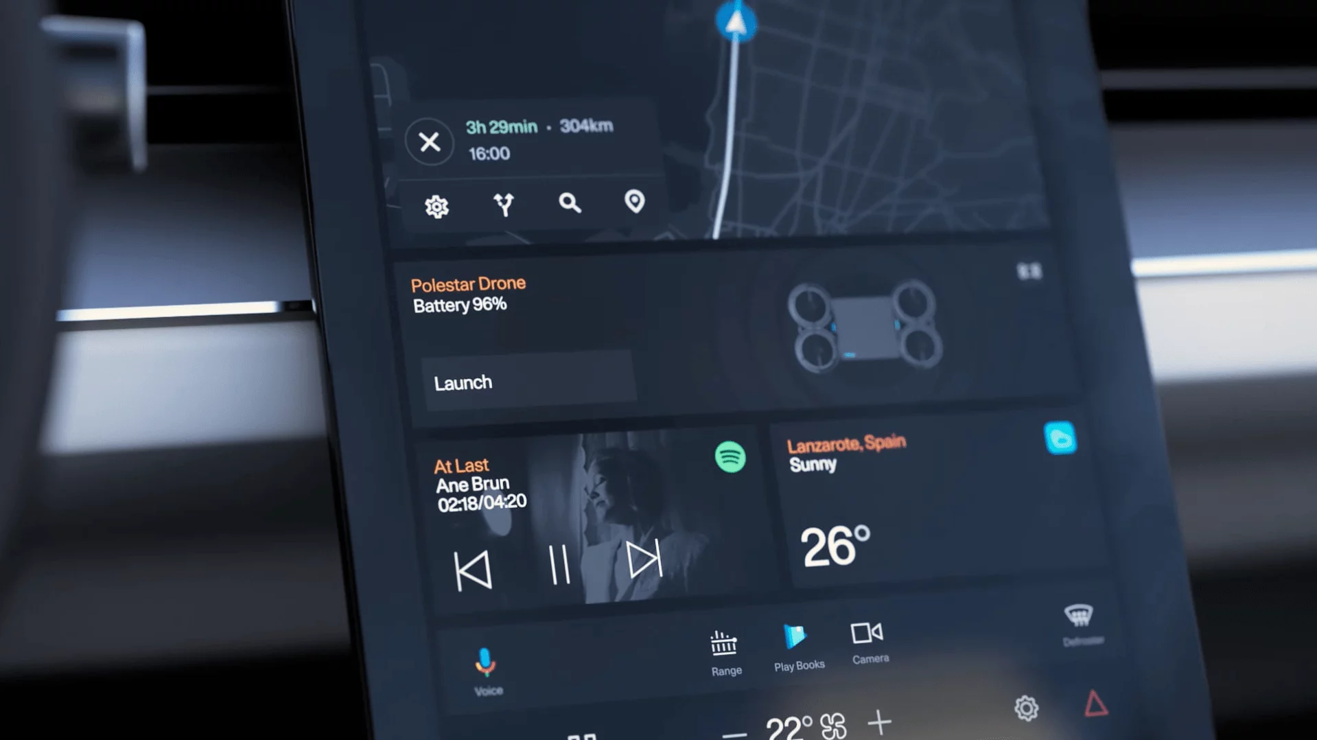
- Navigation, media and climate, the critical flows, laid out for the driver and readable at a glance.
- Voice first, with safe fallbacks for moments when eyes must stay on the road.
- Themes that adapt to light: day and night, contrast, colour temperature.
- Motion used only to show context, never to decorate.
- Design tokens shared with engineering, with CI checks and linting to keep the UI consistent.
- DesignOps routines: crits, UX reviews, a definition of done, KPI dashboards.

Challenges
Three tensions ran through the project: a minimal look against text you can read in a glance; voice, touch and steering-wheel controls that had to agree with each other; and keeping quality up while moving fast.
We handled them with heuristics we could measure, a shared checklist for contrast and touch-target size, and short design-engineering spikes before anything went on the roadmap.
Principles
Vision
An HMI that keeps the driver composed and in control. You notice it when you need it, and not otherwise.
Mission
Safe by default, fast by design, calm in character. Based on evidence, kept in shape by DesignOps, built together with Product and Engineering.
How I led
Be clear, leave room for craft, and let systems carry the scale. Decisions are written down, patterns are proven in use, and everyone owns quality.
Impact
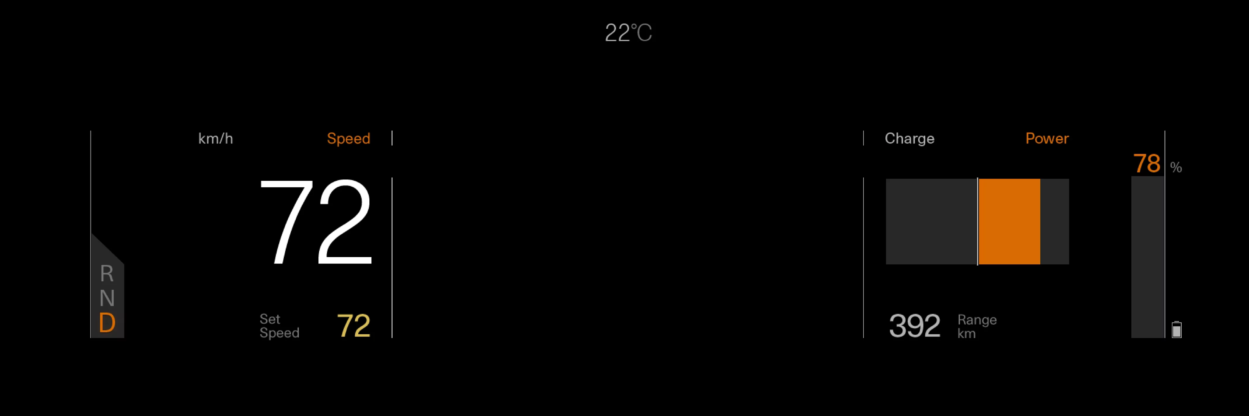
- Clear at a glance. Core tasks ask less of the driver, thanks to simple layouts, consistent placement and detail revealed only when needed.
- Quicker tasks. A simpler structure, voice and touch together, and motion you can predict.
- A faster team. Shared tokens, components and reviews raised both output and quality across disciplines.
The result is an interface that feels calm but answers quickly. It guides instead of shouting, and its foundations (structure, patterns, tokens) carry over to other trims and markets.