Starting a UX practice inside Australia's leading ERP
2022-2026 | Case study / by Carmelo Bisignano, User Experience Designer Lead

Project information
- Industry
- ERP, SaaS
- Duration
- 4 years
- Team
- 1 design lead, 1 scrum master, 5 engineers, 1 product manager
- My role
- UX strategy and leadership, Design system architecture, Product requirements, User research and testing, Service design and blueprints, Working across product and engineering
- Users
- Employees, Managers, Payroll officers, Administrators, People outside Pronto
- Tools
- Figma, Confluence, Jira
Carmelo's been an absolute legend to work with. He jumped into our UX space with confidence and clarity, helping shape some pretty critical experiences.
Overview
Pronto Software is Australia's leading ERP vendor. When it began moving Pronto Xi from a legacy 4GL system to cloud microservices, the New Technology Stack (NTS), it had no designers.
I joined as UX Designer Lead to start the practice: set up how design works, build the design system, and shape the product across Pronto Xi in a company that had shipped software for decades without a designer in the room.
The work covers six products: the Employee Portal on desktop and mobile, employee onboarding, an AI assistant, global navigation and search, a no-code UI builder, and customer communication.

The problem
There was no component library, no design language and no shared process between design and engineering. Before I could design a better interface, I had to show why design mattered in a company that had never needed it.
Users had their own mess. Payroll officers processed awards by hand, tracked timesheet differences in spreadsheets and asked colleagues to double-check data. The system never warned them: they logged in to find problems. Onboarding ran on email threads and paper forms. There was no single place to see staff paid, gross totals or pay run variances, and no automation where it was needed most.
The architecture was also changing under me. Moving from a monolith to microservices meant design decisions often had to come before engineering ones. Superannuation validation, BSB checks and GDPR/CCPA added more rules. Every flow had to be structurally right before it could be drawn.
Research
Research didn't happen once at the start. It ran through the whole project, inside a DesignOps framework I set up early: empathise, define, ideate, prototype, test, with loops back from delivery to discovery. Every sprint started from written evidence rather than opinion.
Discovery
We started in September 2022. Before any wireframes, I ran workshops with the UX support team and the wider engineering team to map the current information architecture, walk through payroll officer and employee journeys, and find where the old structure was letting users down.
Out of those came a Concept of Operations: a document describing how the new system should behave, which product, design and engineering all signed up to. Requirements waited for the ConOps, and the ConOps waited until we understood how users thought about their work.
Listening to payroll officers
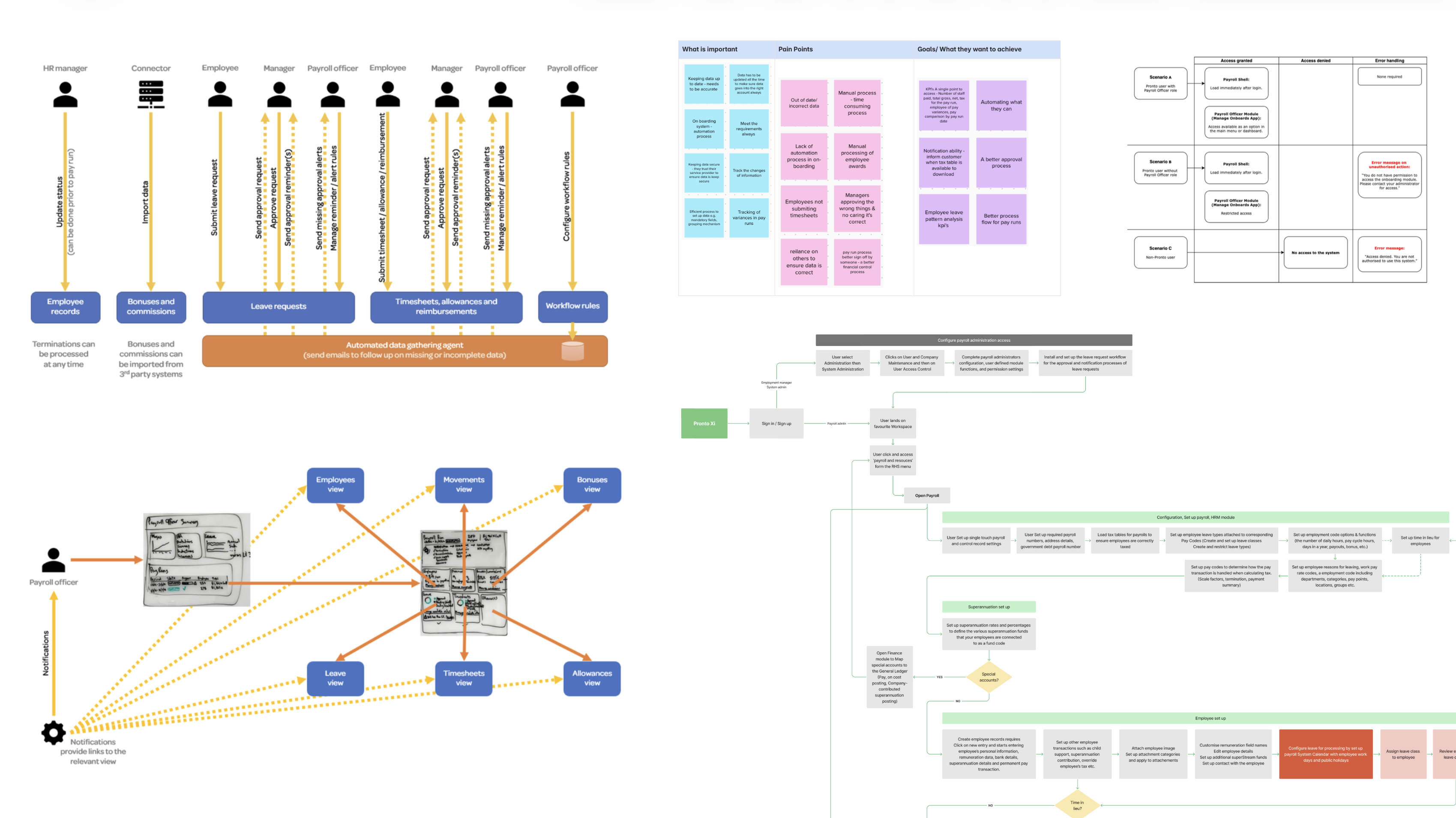
Sessions with payroll officers and HR teams kept surfacing the same problems. Nobody told them when something was wrong. They found missing timesheets, unapproved leave and incomplete records only once those were already holding up a pay run, and then had to chase people for data the system could have tracked itself.
What they wanted was just as clear: one dashboard for wages, leave trends, pay run progress and HR actions; reminders that escalate up the management chain when ignored; and a pay run screen you can watch rather than constantly push.
We turned this into a Payroll Storyboard, a swimlane scenario of the whole pay run across HR managers, connectors, employees, line managers and payroll officers. It wasn't a spec for engineering. It was the picture of how the system should behave, proactive and automated, and every later decision was checked against it.
Service blueprint and journeys
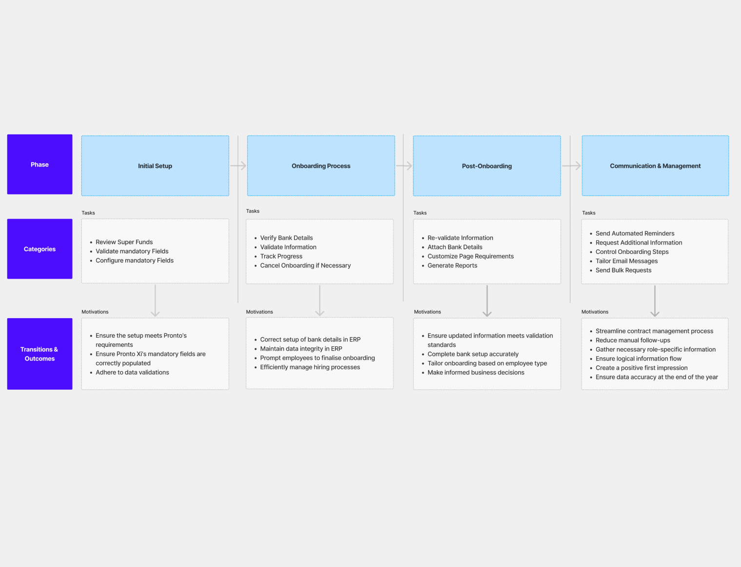
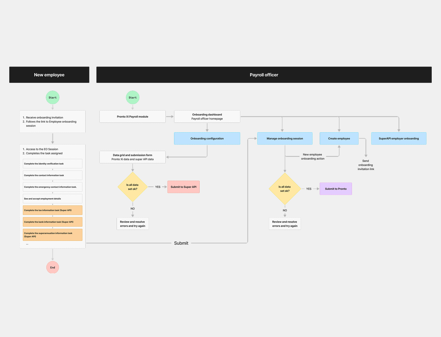
For onboarding, the research became a service blueprint covering pre-hire, day one and after, across five layers: what the user does, what they see, what the system does behind the scenes, support processes and compliance.
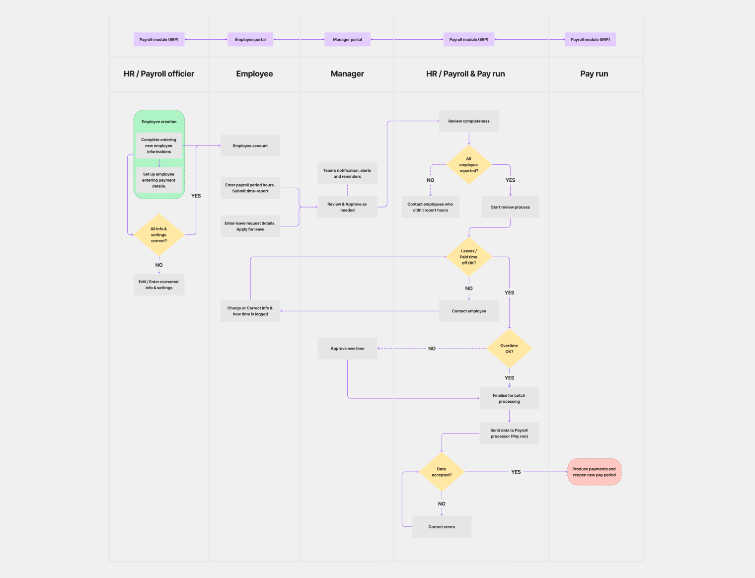
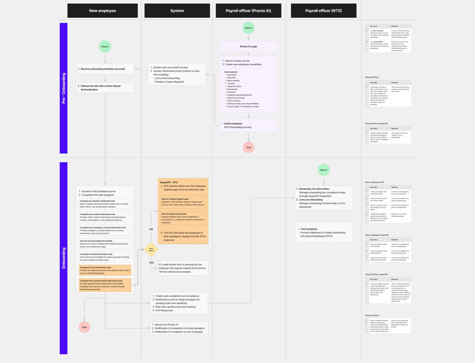
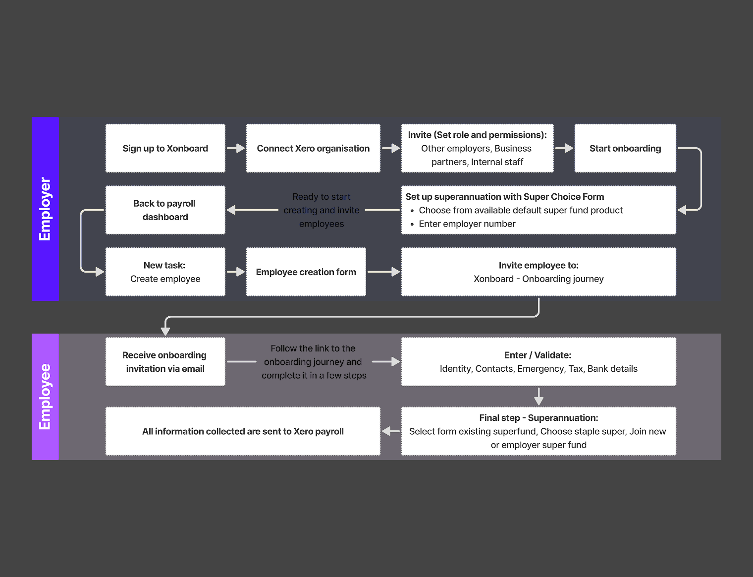
Next to it I drew a swimlane flow with four lanes: new employee, system, payroll officer in Pronto Xi, payroll officer in NTS. It showed where work passed between roles, where the system should act on its own, and where a person had to decide. I used both documents to write UX requirements and business logic together: the employee's screens (invitation, registration, tasks, profile) and the payroll officer's (create employee, assign tasks, SuperAPI compliance, progress). You couldn't design one side without understanding the other.
Competitors
I compared Workday, SAP SuccessFactors, Oracle and Odoo on information architecture, UI clarity and features across payroll, workforce management and self-service. Workday set the bar: clean, with smart automation and a people-first feel. SAP and Odoo were good but heavy to navigate; Oracle felt the least joined-up.
The gaps fed straight into navigation, the launchpad and onboarding. The comparison also confirmed what users had told us: the best platforms bring problems to you instead of making you hunt for them.
Testing navigation before choosing
Navigation touches every user every day, so it was one of the riskiest decisions. First I evaluated the existing system against 16 usability principles, including consistency, efficiency, learnability, error prevention, accessibility, role-based access and contextual help, to pin down where it failed.
Then I designed and tested five navigation models. Model 0 was the current side tree with a collapsible rail. Models 1 to 4 tried a top shell with dropdowns, business-specific menus, contextual sub-navigation, breadcrumbs, and a left rail combined with module dropdowns. Each was prototyped and tested with users on set tasks, with a Microsoft Forms survey collecting both scores and comments.
Users liked a clean, well-grouped landing page and clearly named modules. Any split navigation, with the entry point in one place and the second level somewhere else, confused them. They couldn't find the home button when it was tucked away, and "Overview" meant nothing on its own. The winner combined one top navigation, strong breadcrumbs, and a dropdown that turned "Overview" into a way into the dashboard, the working board and the manager view. The final system was built directly from what users rejected and what they kept.
Design
Design built on the research in small steps, side by side with engineering, and every decision could be traced back to a documented need.
The design system
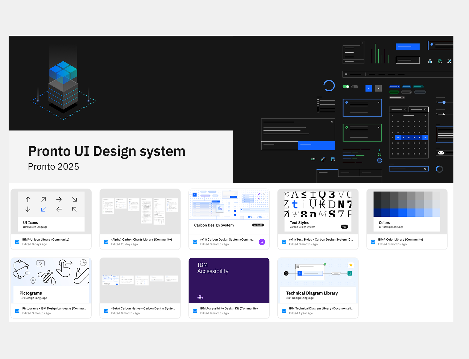
The design system is what the whole product runs on. It's based on IBM Carbon v11 with Pronto-specific additions: 44 components documented over 56 pages, with tokens for colour, spacing and effects. Where Carbon didn't cover ERP needs, I built components from scratch. Each one moves through Labs, Preview and Stable, so engineering always knows what is ready to build.
I added three AI components (AI label, AI layer and an explainability popover) before the AI assistant existed. When the product was ready for AI, the system already was, with no retrofit sprint.
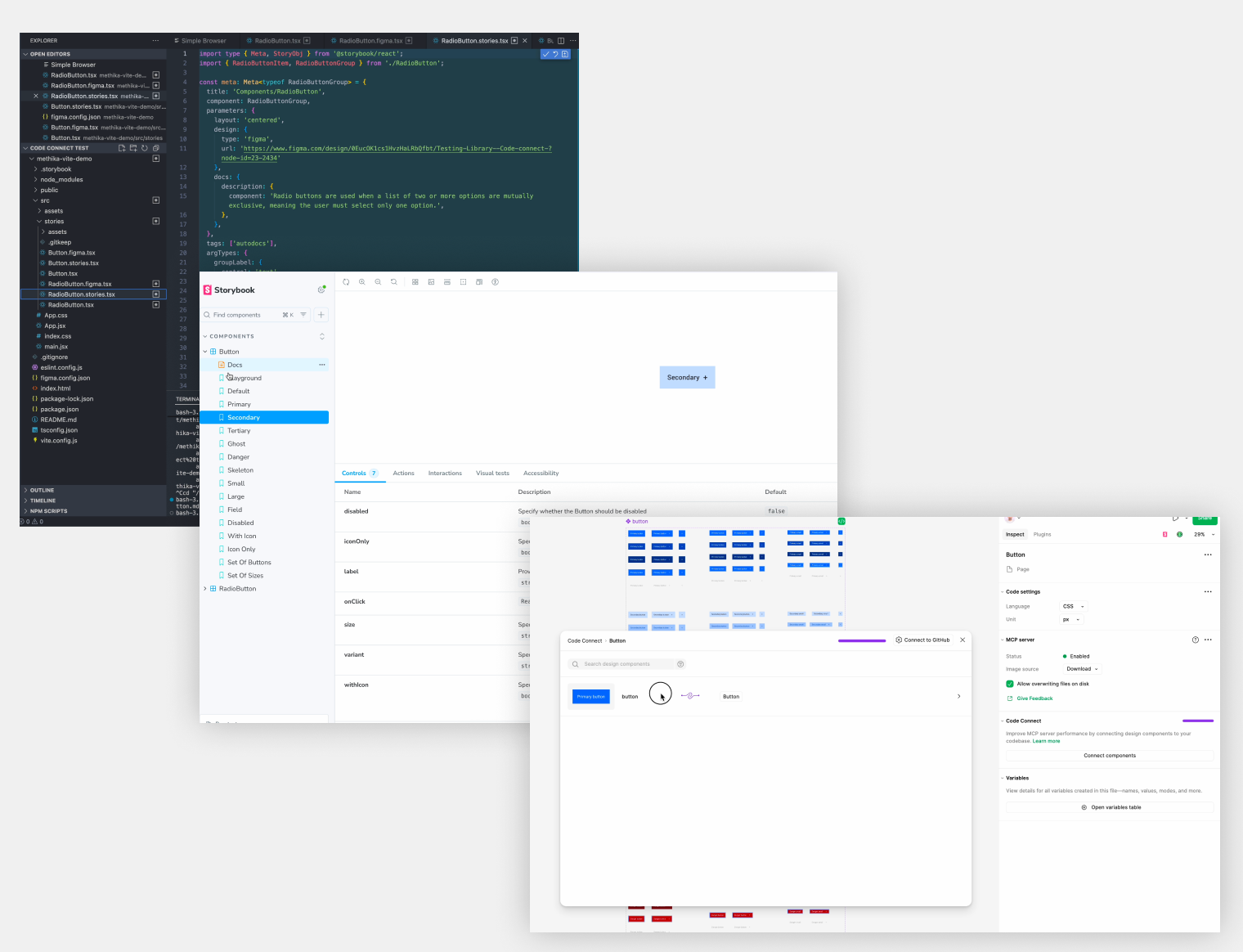
Tokens and components are linked to the codebase through Code Connect, so design and engineering work from the same source and handoff stops being a step of its own.
Navigation and structure
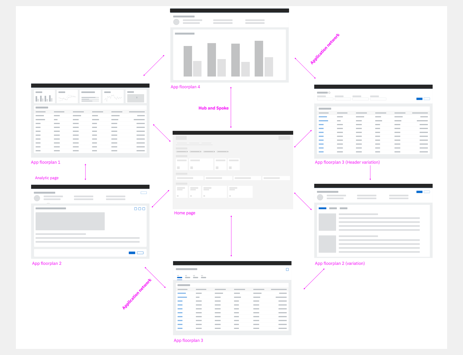
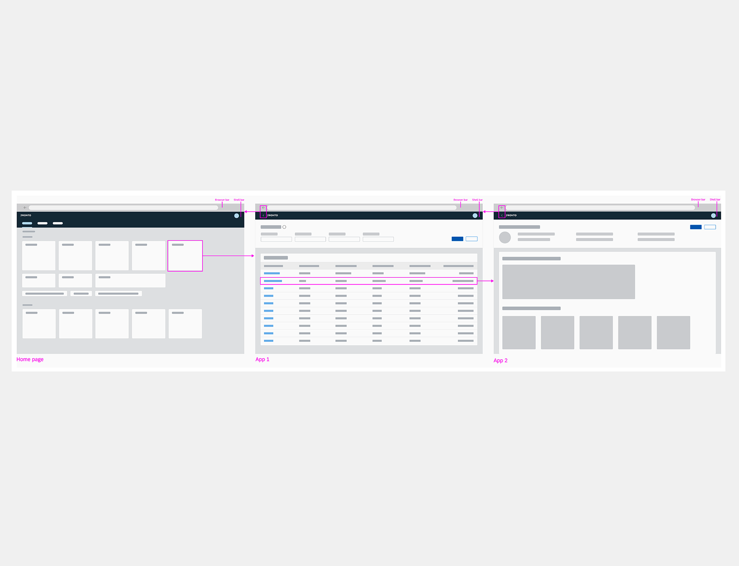
The research led to a hub, spoke and object model: a launchpad as the hub, spoke views for lists, object pages for single records. Any programme is at most three levels from the launchpad, so users don't get lost in deep menus.
Five spoke templates (object page, overview, analytical, fast entry or wizard, list report) give every screen a predictable shape, so people always know where they are and how to get back. Task completion got 40% faster, confirmed over several rounds of documented testing.
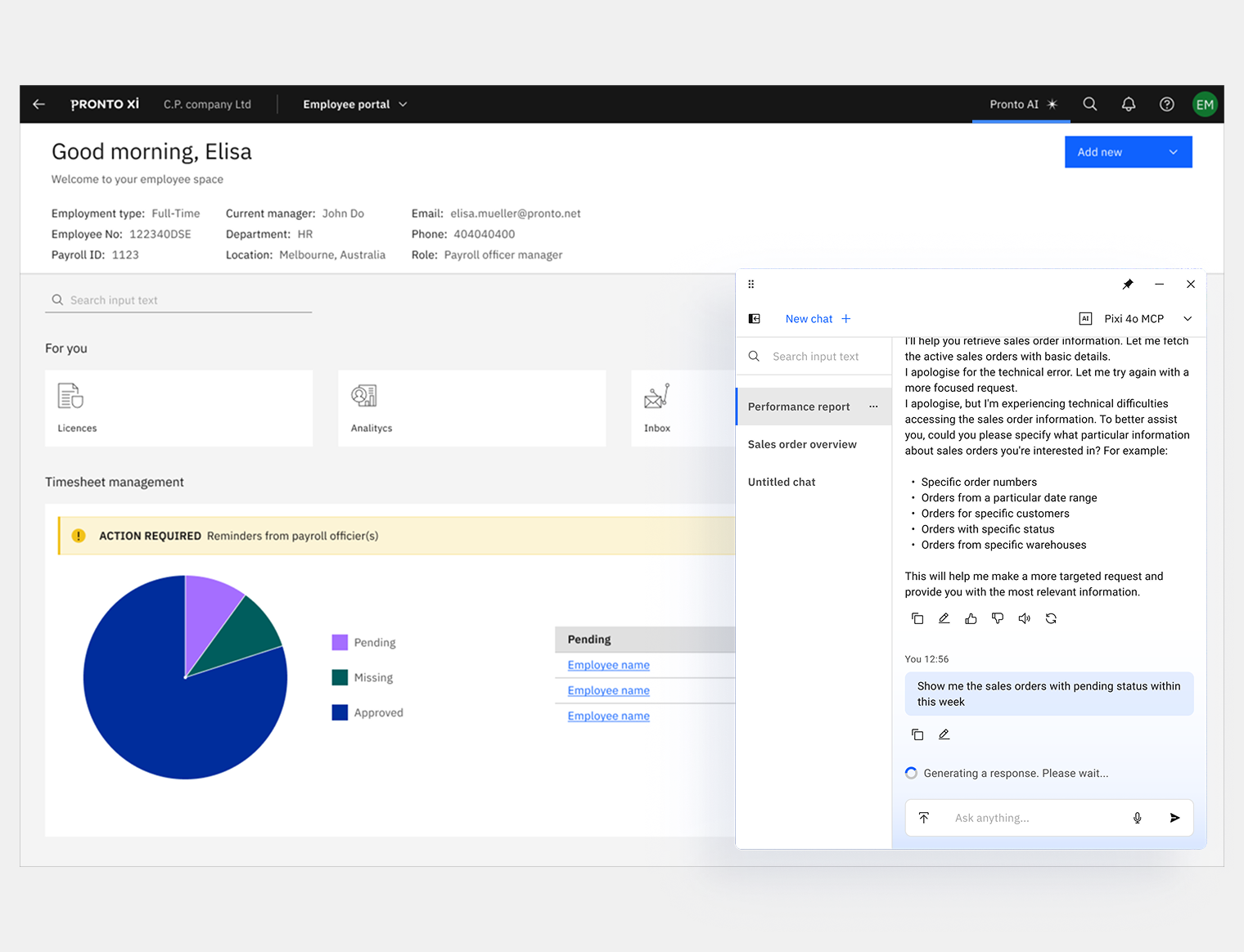
Pronto AI
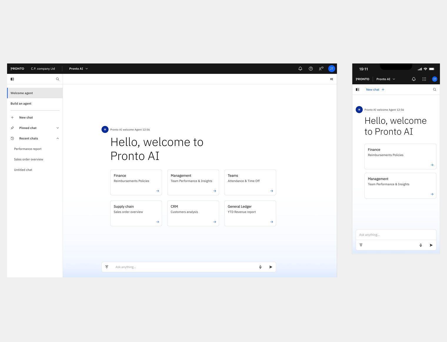
Pronto AI is the assistant inside Pronto Xi. Before designing it, I used an AI context model, looking at people (domain experts), business (operational needs), machine (what ML can do) and world (outside data and policy), to decide where AI would really help and where it would just add noise.
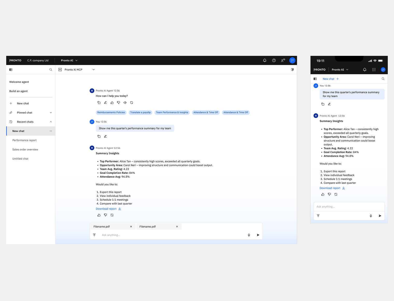
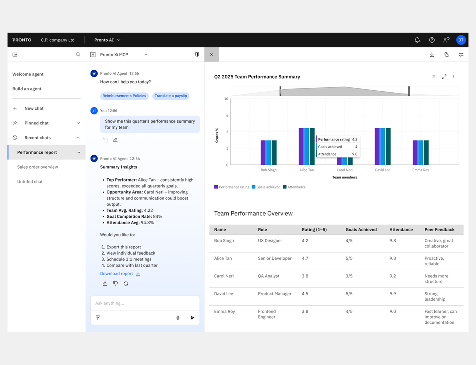
It has two modes. Assistive mode answers inside the current screen, so the user doesn't lose their place. Immersive mode is a full-screen chat with history, rename, archive and live voice input.
The proof of concept was shown at Pronto's sales conference before full design. Because its components were already in the system, building Pronto AI needed no structural changes.
Employee onboarding
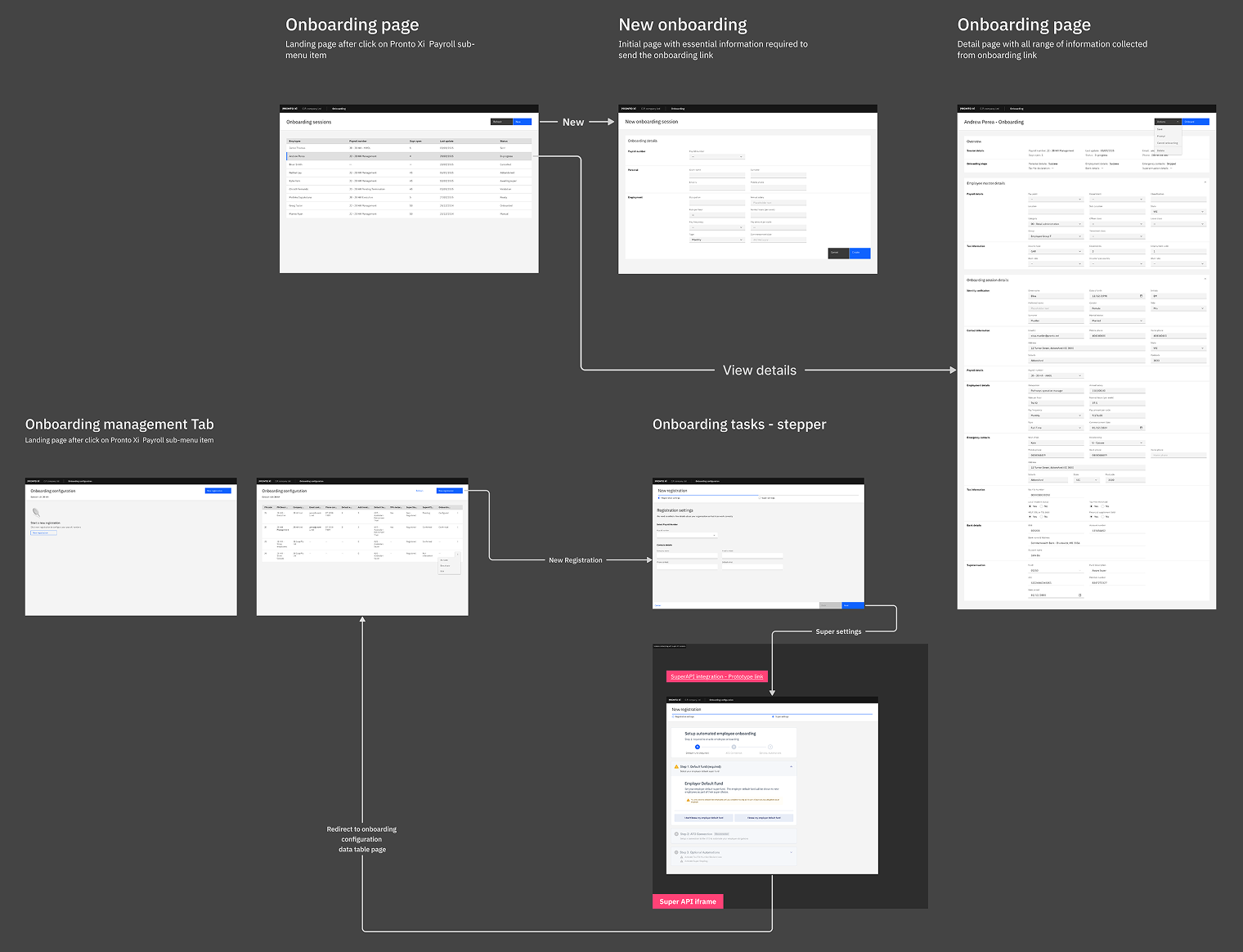
Onboarding was the first area to ship on the new platform, and it got research to match its complexity: the swimlane, the service blueprint and an analysis of the XOnboard and SuperAPI processes all went into the design.
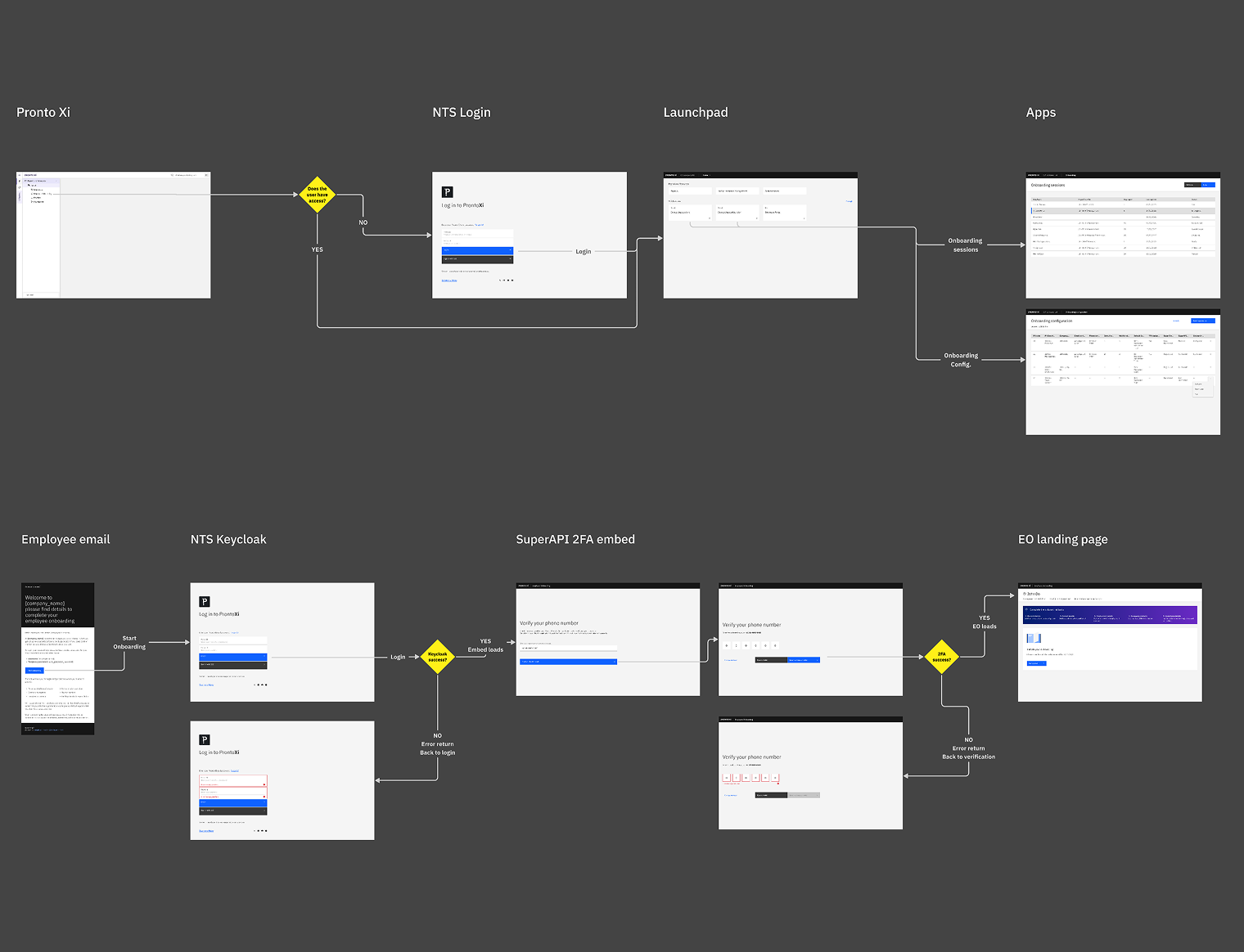
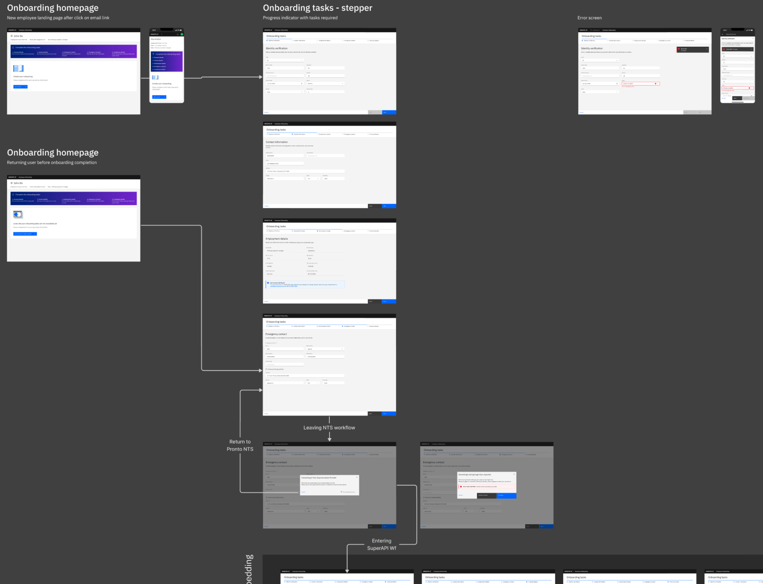
I designed four flows, for the new employee, the payroll officer, the employer and the payroll app launch, each now V1 Stable with its own versioned documentation. The employee flow covers a token-based invitation, identity check, personal and contact details, tax file number, bank account, choosing a super fund through SuperAPI, and reviewing employer details. The payroll officer flow covers creating the employee, managing onboarding sessions, SuperAPI compliance, assigning tasks and following progress from the NTS dashboard.
It went well beyond screens: emails, two-factor authentication, the full service blueprint and ATO compliance through SuperAPI were all in scope. This was a service design problem first.
Employee Portal
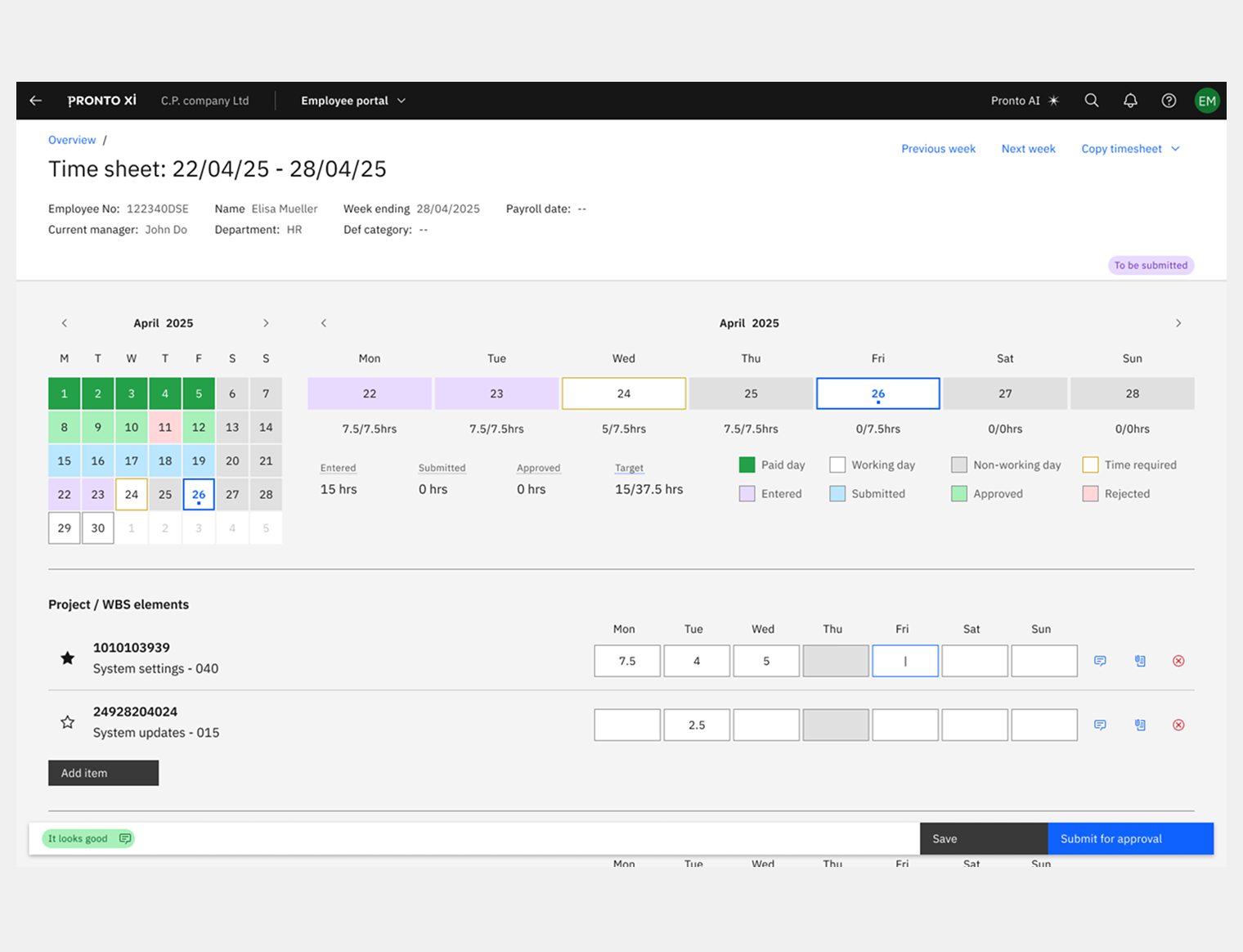
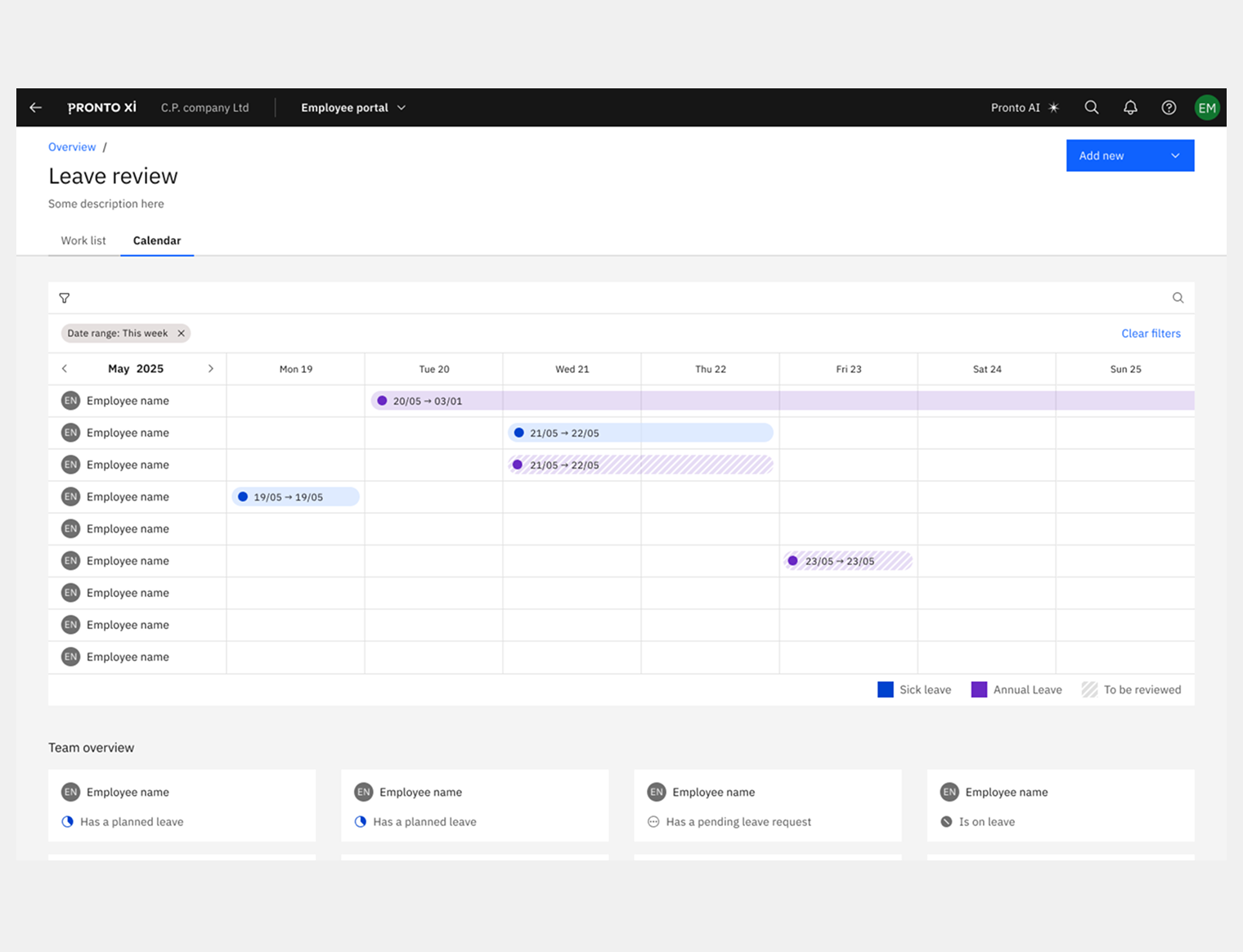
The portal is where people work every day: personal details, employment records, leave, timesheets, manager views, switching company and settings, on desktop and mobile. Employment details alone went through three formal reviews, each adjusted with engineering and tested with users, before reaching the current MVP. Managers get their own layer, with different responsibilities but the same design language.
Pronto UI Studio
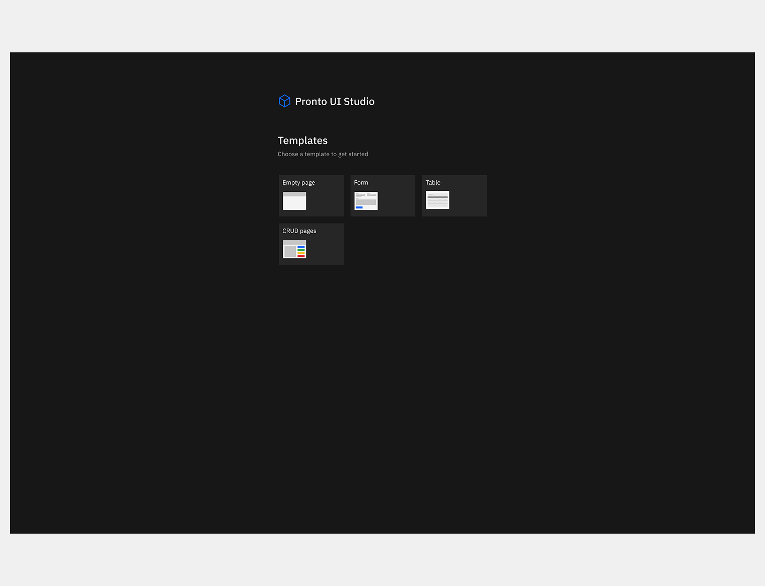
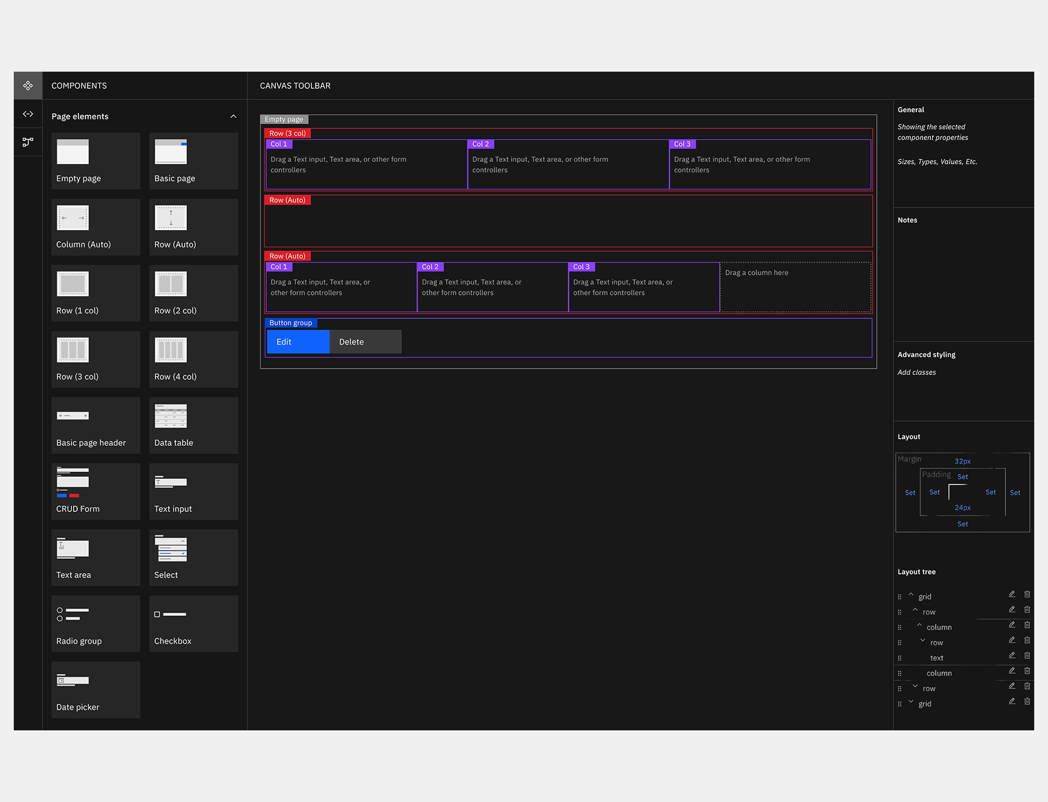
The design system also had to work for the developers building with it. Pronto UI Studio is a no-code builder where they compose screens by dragging components into responsive grids. The first version was hard to use: it wasn't clear where a component could go, how rows and columns related, or which components fitted which zones.
I treated developers as users like any other. They needed clear drop zones, colour to tell layout areas apart, instant feedback when a drop wasn't allowed, and helper text so they didn't need the docs. I looked at IBM Carbon UI Builder, SAP Business Technology Platform and Bubble.io for patterns that work at this scale. The new version has a grouped component panel on the left, labels and colour on the canvas, and a properties panel on the right.
Requirements
UX also shaped the product definition. I wrote the requirements for seven feature areas, with user stories, sprint estimates and release plans, in Confluence. Engineering, product and stakeholders worked from them, so the design work fed the backlog directly.
Challenges
- Earning a seat. In a company run by engineers, design earned its say sprint by sprint, by helping with architecture decisions as well as delivering screens.
- A moving architecture. Requirements often had to exist before the services behind them. The ConOps and the swimlanes kept design and engineering aligned through that.
- Compliance. Super validation, BSB checks, GDPR and CCPA shaped interaction decisions throughout.
- AI before AI. Putting AI components in the system early was a bet on where the product was going. It paid off with no rework at launch.
- Five roles, six products. The design system kept them consistent, because it was built as infrastructure.
Impact
- 90%of MVP use cases passed user testing
- 40%faster task completion in navigation
- 30%stronger UX against competitors
- Against competitors. 30% better UX positioning, measured in a structured comparison with Workday, SAP SuccessFactors, Oracle and Odoo.
- Navigation. Tasks completed 40% faster, tested over 88 navigation frames and several documented feedback rounds.
- MVP. 90% of use cases passed user testing, across 576 production-ready frames covering all five roles and six products.
If you're scaling UX across several products, bringing design into an engineering-led company, or building a design system the whole product runs on, this kind of long, embedded role is where I do my best work.